Understanding Cross-Browser Compatibility: Why Your Website Looks Different Everywhere
Cross-browser compatibility refers to the ability of a website to function correctly across different web browsers and devices. In an era where users access the internet through various platforms like Chrome, Firefox, Safari, and mobile browsers, it's essential for web developers to ensure that their sites render consistently across all of them. Discrepancies in how browsers interpret HTML, CSS, and JavaScript can result in variations in layout, functionality, and overall user experience. This Smashing Magazine article delves deeper into why these inconsistencies occur and what developers can do to mitigate them.
To ensure cross-browser compatibility, developers can follow best practices such as using standardized coding techniques, testing their sites with multiple browsers, and utilizing tools like browser developer tools and services such as BrowserStack. It's equally important to stay updated with the latest web standards, as older practices may not function as expected in modern browsers. Emphasizing thorough testing and adopting responsive design principles can significantly enhance the usability of your website, regardless of the user's chosen platform. For more insights into testing strategies, consider reading this informative Telerik blog post.
Common Causes of Inconsistent Website Appearance and How to Resolve Them
When it comes to maintaining a consistent website appearance, several common causes can lead to discrepancies that frustrate both website owners and visitors alike. One prevalent issue is incompatible themes and plugins. When themes or plugins are not updated or do not work well together, they can cause elements on your site to appear differently across various pages. Additionally, using multiple content contributors can lead to inconsistent design choices, as different authors may not adhere to the same styling guidelines. For a deeper understanding, check out this insightful article on choosing a consistent theme.
Another significant reason for an inconsistent appearance is the lack of responsive design. Websites that are not optimized for various screen sizes can look drastically different on mobile devices compared to desktops. To resolve these issues, it is essential to implement a cohesive design framework that includes clear guidelines for customization and ensure that your site is built with responsive design principles. Furthermore, regular audits of your website's appearance can help identify and rectify these inconsistencies early on. For more information on responsive design, refer to this resource on responsive web design guidelines.
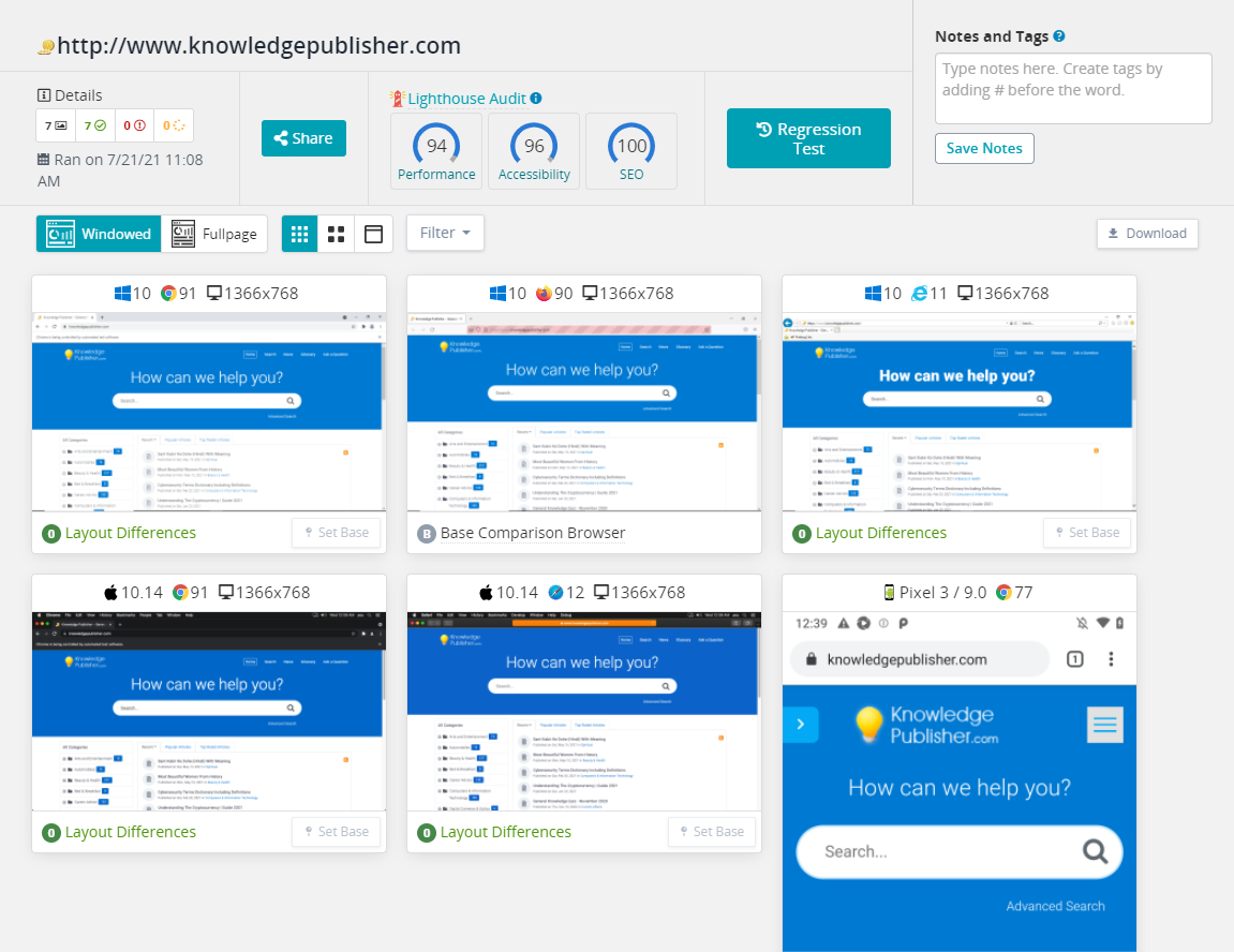
Is Your Website Responsive? Exploring Differences Across Devices and Browsers
In today's digital landscape, having a responsive website is more critical than ever. A responsive design ensures that your site adapts seamlessly across various devices and browsers, providing a consistent user experience. According to a study by Statista, mobile devices accounted for over half of global web traffic in recent years. This statistic highlights the importance of optimizing your site not just for desktop users but also for mobile and tablet users. Failing to do so can lead to higher bounce rates and a negative impact on your SEO rankings.
To assess your website's responsiveness, consider testing it across multiple platforms. Tools like Google's Responsive Web Design Basics offer valuable insights into how your site performs on different screen sizes. Additionally, it's important to keep in mind that not all browsers render your site in the same way. For instance, while Chrome might display your site perfectly, users on Safari or Firefox might encounter issues. Regularly testing and updating your site can help you identify and fix any discrepancies, ensuring that visitors enjoy a smooth experience regardless of their device or browser.